Overview
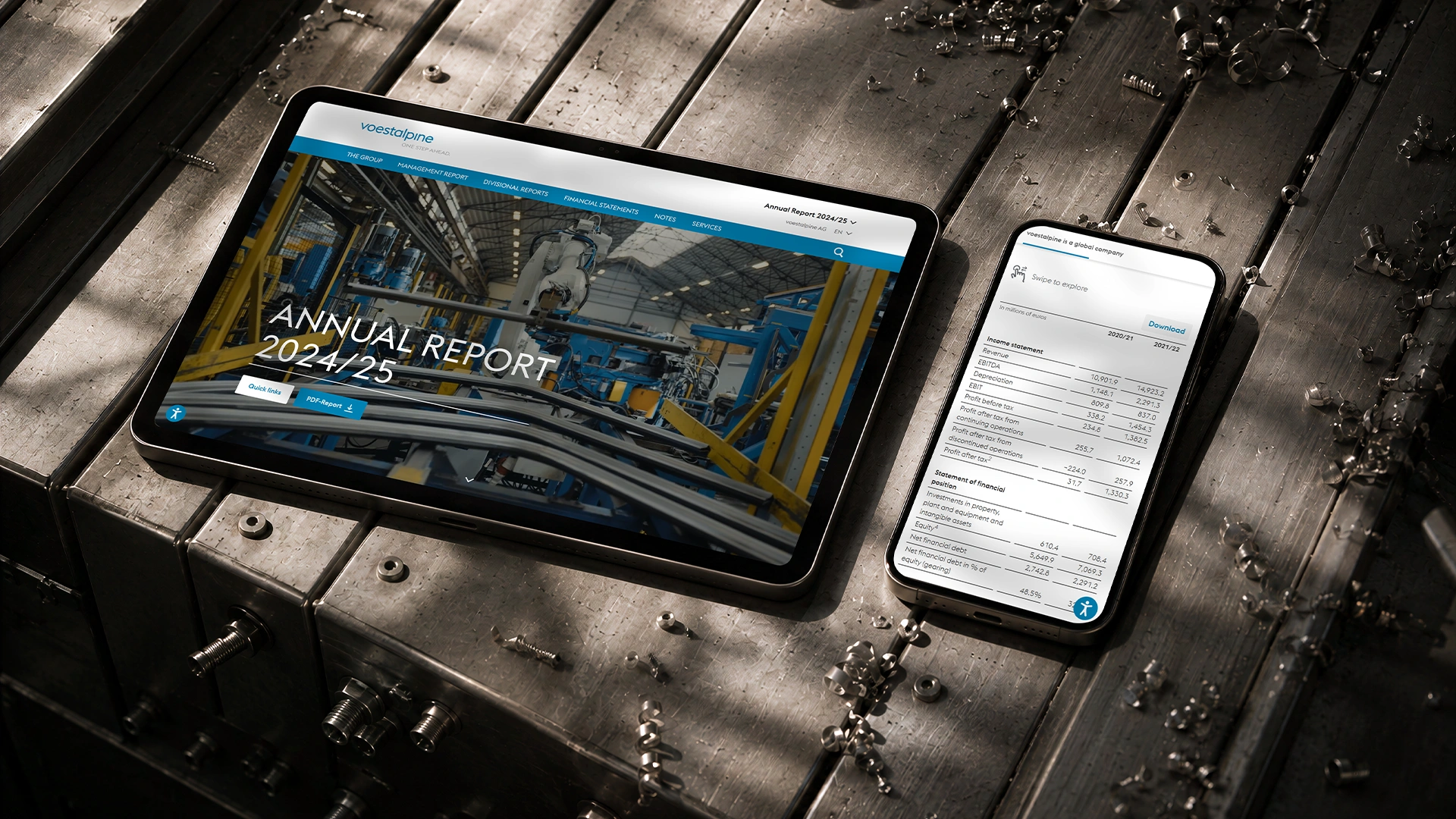
A tablet and a phone on a brushed-steel surface scattered with metal shavings; the tablet shows the voestalpine Annual Report 2024/25 landing page with a factory-robotics image, the phone a financial data table

voestalpine — Redesigning a digital annual report without losing its identity

voestalpine’s online annual report had remained unchanged for eight years and no longer reflected the company’s quality or supported an enjoyable reading experience.

In 2025 my challenge was to create a cleaner, more contemporary experience while ensuring it still felt unmistakably voestalpine.
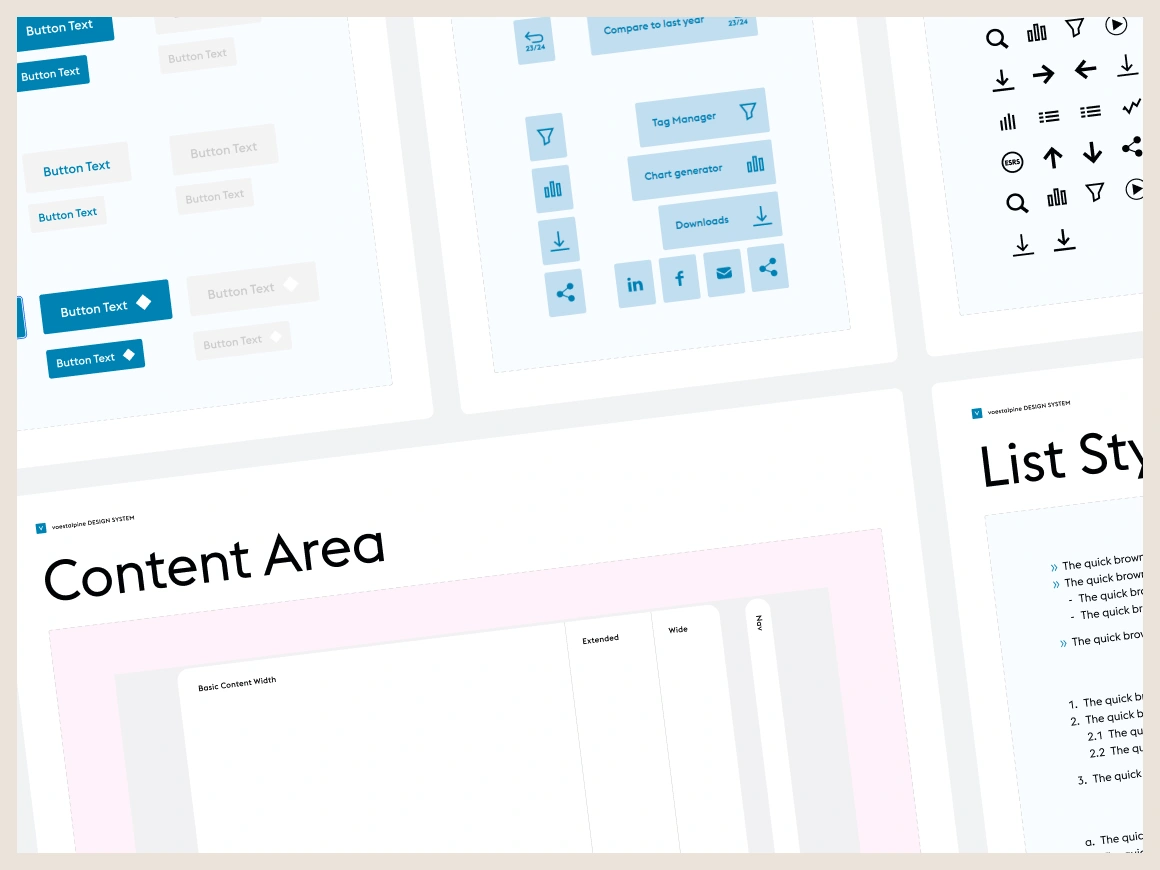
Pages from the voestalpine design system: button styles, an icon set, UI component groups and the content-width and list-style specifications
Since there was no comprehensive design system or brand guide to build upon I started by exploring voestalpine’s existing digital ecosystem to identify the visual patterns that defined the brand.

Based on this research and the limited assets provided by the client, I created a design system that established consistency and served as the foundation for the redesign.
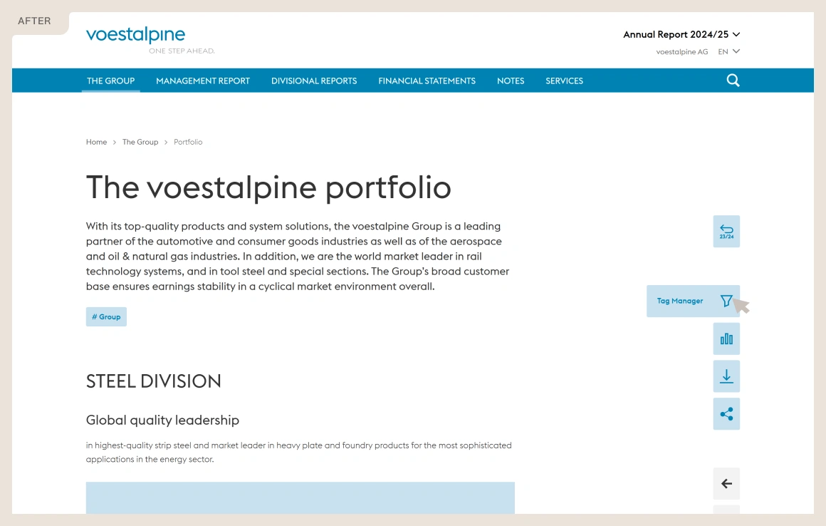
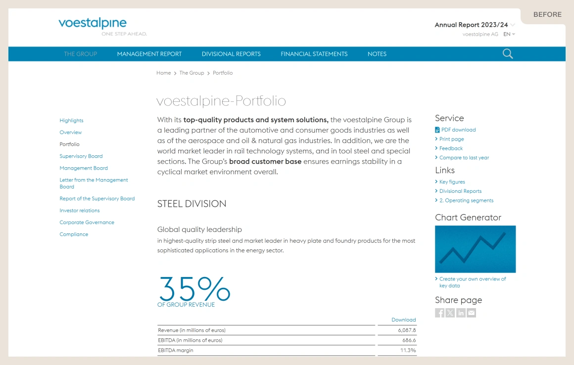
The original voestalpine annual report (2023/24), labelled ‘Before’ — a dense portfolio page with a left-hand sidebar navigation The redesigned voestalpine annual report (2024/25), labelled ‘After’ — the same portfolio page with cleaner typography, more space and a floating tool sidebar
By keeping familiar structures and strengthening hierarchy, spacing and typography, I created a cleaner, more contemporary interface that remained recognisably voestalpine.

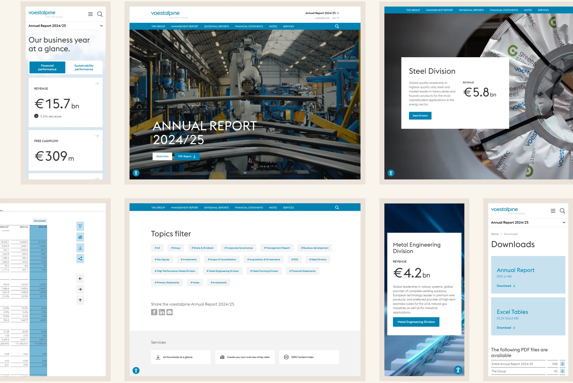
The redesign focused on improving readability and navigation, while introducing an engaging landing page that encourages exploration and provides clear entry points into the report’s content.
A collage of the redesigned voestalpine 2024/25 report: the mobile ‘business year at a glance’ figures, the factory-robotics landing page, divisional revenue cards and the topics filter

User Guidance

Helping readers navigate the vast information contained in an annual report without feeling overwhelmed was an important design challenge.

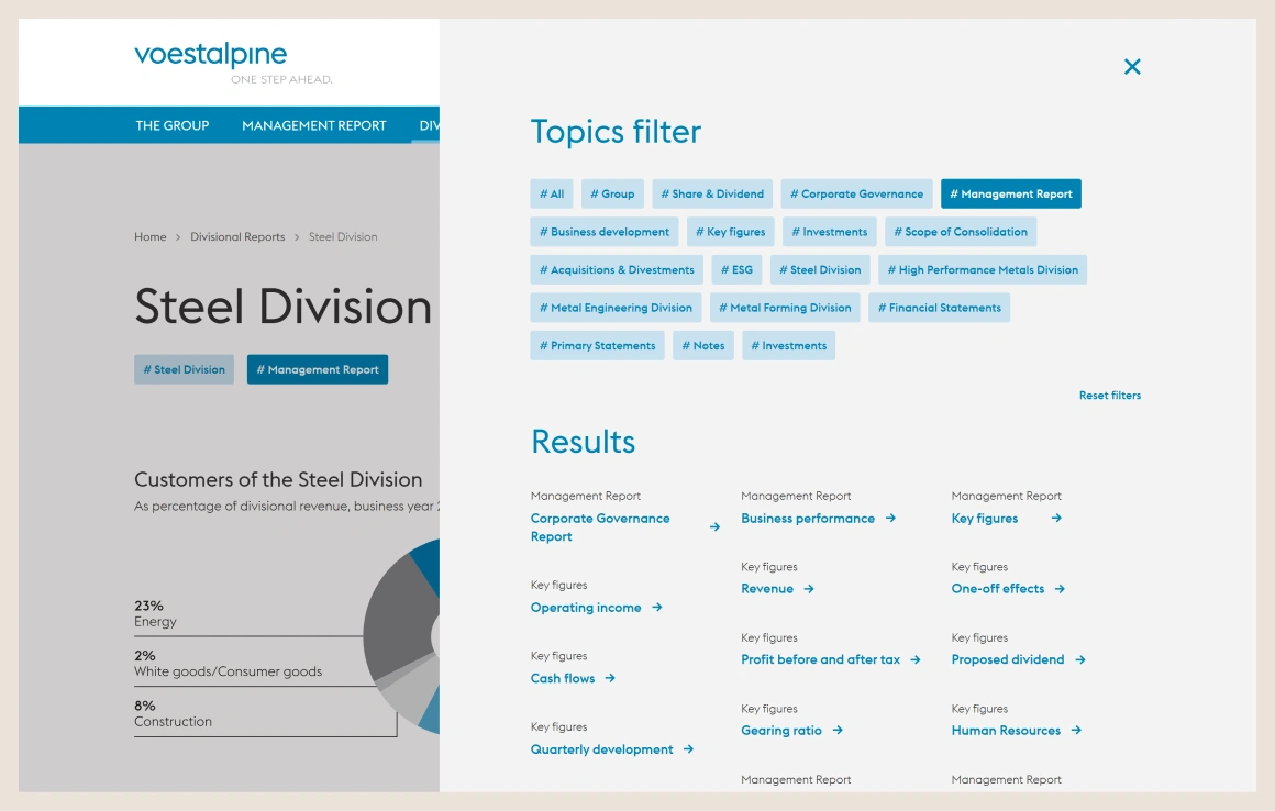
The redesigned report’s topics filter open over a Steel Division page — category chips and a results list that link related content across the report
To support this, I designed a topic filter — present on each content-page — that connects related content across the report and helps users quickly find relevant information.
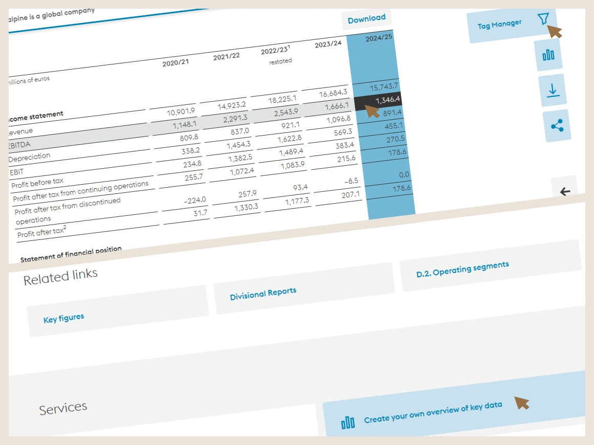
A key-figures table in the redesigned voestalpine report — five years of income-statement data with the latest year highlighted — beside a tool sidebar, ‘Related links’ cross-references and a ‘Create your own overview of key data’ option
The topic filter as well as other important features and related links are present as sidebar and at the end of each content page.
Keep scrolling to open the next case study